Episode Transcript
[00:00:00] In this episode, the spotlight is on mastering beauty shots, not to be confused with glamour shots. Get ready for actionable tips on everything from visual storytelling to photocomposition, color theory to cultural awareness for global brands. Let's get into it.
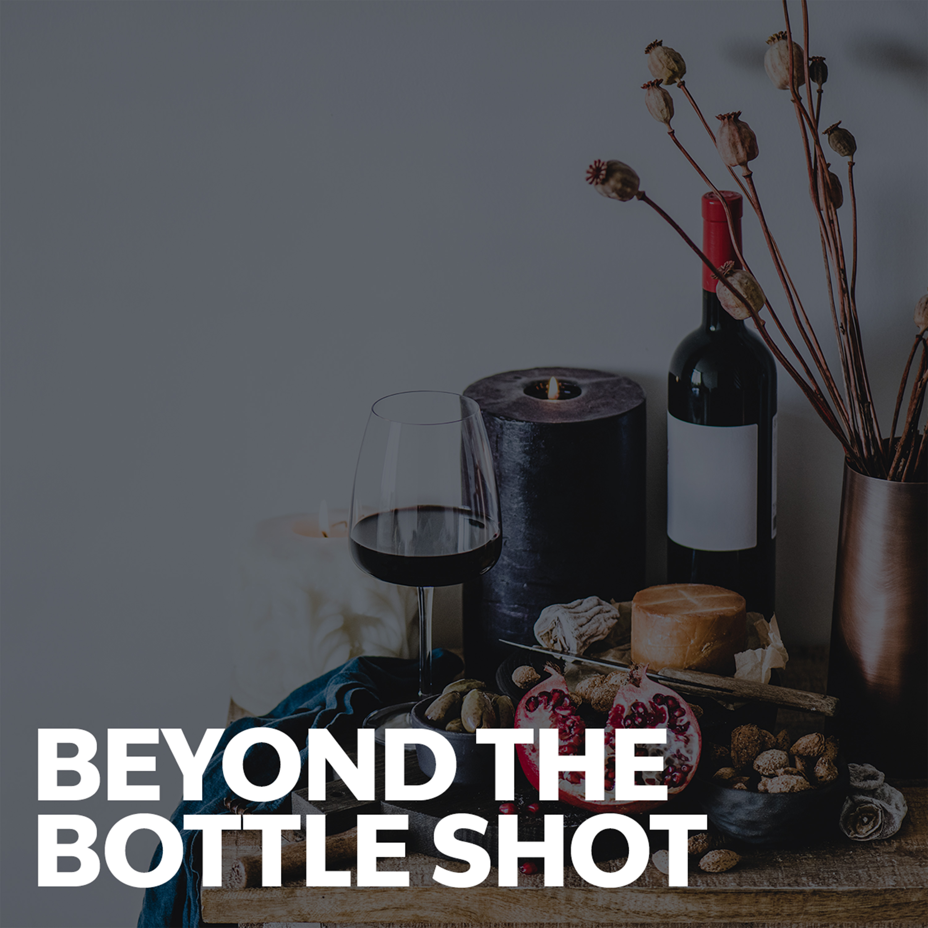
[00:00:23] Hi and welcome. Or welcome back to head training, the series where digital marketing meets the wonderful world of wine. I'm Polly Hammond, founder of Fiforist, and today I want to talk about product photography beyond the simple pack shot. Stick with me and you'll learn how to create visually stunning images that not only showcase your brand, but also tell a compelling story, evoke emotions and align with your brand's identity. There is even a bonus round at the end on best practices to ensure that your photo library is SEO friendly. At Fiveforest, we break product and marketing photos into three distinct categories, lifestyle photography, beauty shots and pack shots or bottle shots. Three photos may all feature the same bottle of wine, yet serve very different purposes in engaging the consumer. They each convey different messages at different moments in that customer's journey, and that's why it's important that you have a nice mix of all three. So let's start by briefly defining each category. Lifestyle photography, which we discussed at length last week, is about storytelling and context. It places your product within a real life scenario, showing how it might be used for the kind of lifestyle it represents. The focus is on creating relatable and aspirational images that connect the product with a certain lifestyle or emotion. Lifestyle photography is great for building brand identity and for marketing campaigns that aim to connect emotionally with your audiences. Pack shots are what everyone knows, bottle shots that provide a clear, accurate representation of your wine. Straightforward and unembellished. They show the wine against a neutral background to minimize distraction. The main goal of a pack shot is to inform the consumer about that product. They are essential for online shopping, where seeing the product as it is is crucial for customer decision making. Beauty shots sit somewhere in between. They prioritize aesthetic appeal and emotional connection, but they focus more closely on the product itself rather than its use in a lifestyle context. And you all know what I'm talking about. These are our artsy, stylized bottle photography. They can include closeups and use dramatic lighting, angles and backgrounds to highlight the product's best features and create a mood or feeling. Beauty shots are commonly used in advertising and promo materials, where the goal is to make the product look as appealing and desirable as possible.
[00:02:47] If pack shots are like the tech sheet, beauty shots are like the tasting room experience. They're designed to create desire to tell a story. They speak to the feeling or the ambience that comes with that wine. In consumer engagement, pack shots and beauty shots complement each other. Using both effectively in your digital spaces means balancing these two aspects. While pack shots build trust and clarity, beauty shots create desire. A customer might be drawn in by the allure of a beauty shot, but it's the pack shot that reassures them of their choice to buy before they finalize that purchase.
[00:03:23] In the world of wine marketing, understanding the distinct roles and functions of pack shots and beauty shots is crucial to creating a compelling digital customer journey and building a library of useful marketing assets for your website, advertising, social media and so on. So how to cost effectively amass a library of beauty shots? I'm going to break this down in the same three categories that we used last week. One, think like a marketer, just like with your lifestyle images begin by solidifying your brand's visual style and color palette. This is foundational for ensuring that every image aligns with your identity and resonates with your audience before the shoot. Plan meticulously. I can't stress this enough. If you have to use storyboarding to map out composition, props and lighting. Align these elements with your brand story and the unique attributes of that product, ensuring that everything speaks to the target audience. Subtly weave brand elements or motifs into your shots, ensuring that they enhance rather than dominate the composition. This helps reinforce your brand little by little. Televisional story design scenes that suggest a backstory or a lifestyle. For example, depict a product in a setting that aligns with your narrative, such as an al fresco brunch or a 50th anniversary celebration. Strive to capture images like joy or nostalgia or elegance. Each image should evoke a feeling that's in sync with your messaging. Our super secret at Fiveforest is sequential storytelling. Create a series of images that collectively tell a story. This is so great for adding depth to your narrative across various marketing platforms, and you can use it really creatively to hook your audience. The example that I always reference, and it's for all of us gen Xers, is the taster's choice. Ads with Anthony heads from the late eighty s and early ninety s, and if you haven't seen them, I encourage you to go hunt them down on YouTube or elsewhere. They've been nominated as one of the top 100 ad series of all times and they really capture the hook of sequential storytelling. Now we're marketers, so we can't forget about the psychological triggers in imagery. Leverage elements like familiarity, novelty and sensory appeal to make your images more engaging. This can involve using common cultural motifs or introducing unexpected elements that draw attention. Again, a great example of this is the current resurgence of the 1970s and 80s styles. Similarly, be aware of the cultural context of your images, especially if your brand caters to a diverse global audience. If you're targeting a global market, you either need to plan for geotargeting or you need to choose universally relatable themes and compositions. Practice cultural sensitivity. Be mindful of cultural nuances to avoid misinterpretation or offense, again, ensuring global market compatibility. Last but not least, metrics. Regularly seek feedback on your images through testing or measurables. Use these insights to refine your approach and to enhance future photo shoots. Two think like a designer. Choose the right setting and background. Consider both indoor and outdoor settings that complement your product and contribute to the desired mood or story. Use backgrounds ranging from simple solid colors for focus to more elaborate scenes that add depth and context. Employ various lighting setups, like softboxes for diffused lights and spotlights for highlighting features. Experiment with lighting angles to add depth and mood to your shots. A little composition nerdiness. Employ the rule of thirds and leading lines to guide viewers eyes to what you want them to see. Next, create balanced images using symmetry for luxury or order themed products and asymmetry for more youthful, dynamic brands. Use spacing and perspective wisely. Negative and environmental space should be used strategically to focus on the product, while environmental context can narrate a larger story. Unique perspectives and unconventional angles can make your shots stand out and consider viewer engagement by choosing angles that invite interaction with the product.
[00:07:37] But please be cautious because too many weird angles can make for a very messy or disjointed website. Presentation. Dynamic elements can make for intriguing photos. Use blur or implied motion. Arrange elements to suggest movement, adding dynamism to your images, and incorporate various textures in your props or backgrounds. Explore how your product interacts with different light sources to capture unique moods. Color I'm going to go on a little tear about color for a moment. Color is super important in making your images stand out in digital, and I mean stand out in both good and bad ways. So here's some advice from someone who looks at thousands of wine photos every single month. Red I know the wine industry loves red. Red can evoke feelings of urgency and excitement, but it's also associated with danger and warnings. Overusing red can distract from your calls to action, and it can create a sense of anxiety or aggression, so please use red sparingly in your photos. Next up overly dark colors can create a somber or a heavy atmosphere on a website and this can potentially deter users who are looking for a more welcoming or lighter experience. They can certainly be effective for luxury brands where a sense of exclusivity or elegance is desired. So I would say be mindful and be balanced. Conversely, dull or muted tones allah scandinavian design.
[00:09:06] They can convey a sophistication and a neutrality, but I've seen that too many dull tones make a website look faded, washed out and uncompelling. Also, I want to say that color theory counts. Avoid color combinations that clash or are difficult to view together. Poor color combinations can make your website look unprofessional. They can be visually jarring for the audience. Be careful with trendy colors. While it's important to stay current, relying too much on trendy colors can quickly date your website. It's often better to use trendy colors as accents rather than the main color scheme. And a word on neon, although honestly, I know so few brands that use neons. But I'm going to say it anyway. Neons can be really eye catching. They can also be overwhelming, and they can strain your eyes when viewed on digital screens. Next week I'm going to talk about ugly ads and this is the one space that I can say completely ignore everything I've just told you about color. What about props and people in beauty shots? Choose props that enhance, but don't overshadow or overwhelm your product. Be sure to maintain a pristine prop collection, especially for items like glassware. I've talked about this before to ensure that they are always ready for photo shoots, and of course, you can add human elements. Handholding to introduce warmth and relatability is a great example, but if you do, please make sure that the human elements are brand appropriate. One thing that really stands out to me are fingernail condition, length of nails, and nail color. Whatever you do, always ensure that the main subject is the clear focal point and you can use techniques like shallow depth of field or contrast to draw attention to that focal point. Remember to guide the viewer to what you want them to see. Use the subject's orientation and lines in composition to guide viewers toward key elements or calls to action. But when you're setting this up, I beg of you, please use nondestructive postproduction.
[00:11:04] Absolutely. Use postproduction tools to fine tune your color balance, brightness and contrast. Ensure each photo aligns with your brand's visual style. You might even consider integrating other media, like illustrations or digital art for unique and creative visuals, and it's likely that at some point you'll want to add a badge or a sticker or text to your image you probably want to resize or crop. Please, please do all of this nondestructively. I can't tell you how much it sucks to be sent beautiful images that are simply not usable because they've been resized down to thumbnails or saved with text overlay. Three think like the person paying the bills and that starts with how to invest in the right equipment. If your in house team will be in charge of taking photos, at some point you'll need to equip yourself with a high resolution DSLR or mirrorless camera and a range of lenses. You will need professional lighting gear, tripods, et cetera. And all of this gets very expensive, very fast. So our fiforist recommendation is that before you start buying rent, find a good local camera rental company and test gear to narrow down exactly what you need for your brand when you're ready to buy. There's a booming secondhand market for camera gear and this is great for finding well priced lenses. Just like with lifestyle photos, be sure to capture your product from various angles, top down, side views, close up to provide a comprehensive view. This approach allows for a dynamism and helps customers better understand the product. Of course, be sure to highlight your product's best features. Emphasize the unique aspects of your wine. Focus on specific details that set your product apart, ensuring they are presented clearly and attractively. Build a diverse library with images suited for different platforms. Website social media emails large format include a mix of closeups, wide shots and contextual settings. If you need some inspiration, I've linked the five forest ultimate shot list in the description below. It has over 130 shots listed and it's free for you to download. Keep your library fresh by regularly updating it with images that reflect new products, seasonal changes, or shifts in your marketing. If your shots involve models, specific locations or unique props, ensure that you have the necessary rights and permissions. And be aware this applies to using intellectual property within your shots as well as people. Use digital asset management software for efficient categorization and storage, consistent tagging and file naming, streamline access and use. I talked about that quite a bit in last week's video on lifestyle photography, so be sure to check that out now. Some bonus content that will make your marketers and your billpayers happy. How to boost the digital power of your images these are things that we do behind the scenes for our fiforist clients that get the most digital bang for your buck. Use original images, not stock photos, as often as possible. This will improve Google ranking on image result pages and enhance shareability. Rename images to be descriptive of the content and add your business name to the image. This is a big one for anyone who's sourcing digital product photography from some of our wine industry vendors. You'll notice that their file names start with the vendor's name. Replace that with yours. Use keywords, but don't overuse keywords. This is why we marketers always answer with it depends. Incorporate relevant keywords in the image file name for a wine photo. A relevant keyword might be the type of wine, vineyard name or specific attributes, but be cautious not to overuse keywords in the file name because this could negatively impact search results. Use hyphens to separate words in your file names. This allows for better readability by Google and an example is Napa Valley Cabernet Sauvignon closeup. Aim for a file name length of around five words to be specific yet concise. An example is summer wine glass and use relevant, accurate alt text for your images. Our advice is write the alt text as if you were explaining the image to someone who could not see it. This helps with search engine indexing and it improves accessibility. But please alt text should not be emotive. Do not use it for messaging purposes. When uploading your images to content pages, use captions to help both readers and search engines understand images, and this is especially useful on websites heavy with imagery. Compress your images to improve web page load times. Aim for file sizes, typically somewhere near 100. Cannot tell you how much of a problem this is with winery sites, where we run audits and find five megabyte images all over the website. So that's a wrap for today's episode on beauty shot photography for wine brands. Join me next week for more smart marketing for growing wineries. Until then, don't forget to like and subscribe. Be sure to check out the free shot list link below. And as always, reach out to me or the five forest team if you have any questions about your winery marketing. See you next week.